
The funniest, smartest, and most impactful print adverts ever.
01. Kit-Kat lockdown ad

Every now and again a concept ad comes along that's so brilliantly done, it fools people into thinking it's an official design. Sam Hennig recently created this Kit-Kat ad, which plays on lockdown life so cleverly it's gained massive amounts of attention across the internet.
02. Norwegian Airlines

This ad resurfaced recently on the internet, with folk going wild for the genius concept, so we thought it worth including in this roundup. Originally created in 2015 by Stockholm-based agency M&C Saatchi, the ad, titled Flag of Flags, highlights five hidden flags inside Norway's (including France, the Netherlands and Finland). The destinations (and, of course, prices) are listed inside the rectangles in a pleasingly clean sans-serif typeface.
03. KFC (or is that Ikea?)

When KFC opened a new restaurant in an area of Majorca known locally as "where Ikea is"), the fast food chain decided to lean in to the association. Madrid agency PS21 mimicked Ikea's colour scheme and typography for the ad, leading to some good old brand banter between the unlikely rivals.
04. Sharper than you think

There's nothing worse than trying to cut, well, anything with a blunt knife. And so Hamburg-based design agency KNSK have nailed this print advert for the WMF Grand Gourmet knife. We're not sure why you'd ever need a knife that sharp, but this eye-catching ad leaves us in no doubt that this is one kitchen utensil you shouldn't mess about with.
05. Lime

In 1960, VW sold its trustworthy design to the world by labelling a car a lemon, the word commonly used to describe production defects. It had a minor default, not noticeable to the eye but even so it was taken off the market.
Well, fast forward almost 60 years and a Beetle is, once more, taken off the market. This time it's not for any default but simply because tastes have changed. And so it is a 'lime', and worthy of our print adverts roundup.
06. Happy Diwali

Ad agency Yellow uses a series of wide-eyed animals to highlight the very real problem animals face during Diwali celebrations. With super-bold imagery and bright colours, the campaign keeps the festival spirit. Juxtaposed against this, however, are the terrified eyes and shocking face masks of beloved pets and animals.
07. Children can be scary
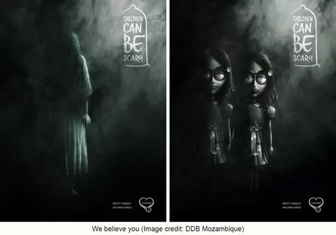
The importance of safe sex can be a tricky topic to address, but DDB Mozambique took a humorous route with this print ad for Lirandzo condoms. The designs feature famously terrifying youngsters from well-known horror stories, including the creepy twins from The Shining, and The Ring's goosebump-inducing Samara. Would you want one of these guys living in your house?
08. IKEA iDealisk

The previous model may have been likened to a trash can, but the when Apple unveiled its new Mac Pro in June 2019, the design drew unkind comparisons of its own: there was something decidedly cheese grater-ish about it. IKEA Bulgaria jumped on the discussion immediately, and within a few days it had released this killer ad. Created by advertising studio The Smarts, the design takes a bite out of Apple with its cheeky tagline and clever lower-case 'i' on the product name.
09. Breakfast means breakfast

Popular yeasty spreadable, Marmite, has carved out an admirable little niche for itself as shorthand for anything that polarises opinion. And over the last couple of years there's been nothing quite so Marmitey in the UK as the result of a certain referendum, so this recent ad, created by Oliver's in-house team at Unilever, feels kind of inevitable. Well played, Marmite. Too soon, but well played.
10. Copywriter needed

There's nothing particularly new about using pictograms to spell out a message in an advert, but we love the twist behind this one. It's a recruitment ad for a copywriter put out by RBH, and the illustrated pictograms spell out 'Copywriter needed', with the ad going on to state that, 'The pictures people have taken over. We need a words person.'
11. You eat what they eat

The amount of plastic being dumped in the ocean is so far beyond what we can comprehend that it doesn't bear thinking about. But that doesn't mean we shouldn't, as the team at German advertising company Ogilvy highlight with this campaign for Sea Shepherd Conservation Society (SSCS), an international non-profit, marine wildlife conservation organisation. The print ad campaign depicts a number of different fish, misshapen by various plastic objects, with the tagline 'You eat what they eat'. The ad goes on to encourage viewers to help clean up our oceans by donating to Sea Shepherd.
12. Open all night

Another great offering from McDonald's, this time from the team at Leo Burnett, who followed the modern and minimal aesthetics of McDonald's communication with this striking visual. In a clever use of illustration, the iconic 'M' becomes lights in the night, sending viewers the message that no matter what time they want to visit, even in the middle of the night, McDonald's is open for business.
13. Where there is one, there are more

Boeker Public Health is a major pest management and food safety company based in the Middle East. JWT Dubai created these beautiful-but-gross print ads based on the idea that when it comes to pests, if there’s one, there will be more. The agency focused on replicated an authentic Russian Matryoshka doll aesthetic, first painting each design onto a wooden surface, then mapping these designs onto a 3D rendering of a doll. The project picked up multiple awards.
14. Piknic Électronik

Ethos painted real fruit for this campaign
This long-running print ad campaign can be found on the streets and subway stations of Montreal, promoting an all-day electronic music festival that is held every Sunday in a park throughout the summer. The adverts feature bright, poppy photography combining fruits with musical equipment; a simple concept that effectively captures the idea of ‘fresh sounds’. Ethos, the studio behind the campaign, created the images by photographing real objects that had been hand-painted in different colours.
15. A Better Job is Waiting

Have you been sat in your job too long?
Created by Joe Public United, this print campaign for a job portal aims to motivate people to stop slogging it out in a job they don’t like. Deftly retouched photos show bored workers at their desks, sat still for so long mould has started to grow on their bodies, or spiders have set up their webs on them.