
Food packaging design can sometimes feel quite intimidating, even if you’re a pro graphic designer. It’s one thing trying to convey your brand messaging effectively, it’s a whole other ball game trying to make sure you’re ticking off label requirements with your local food standards agency. But with anything daunting, it’s not so scary once you know how to do it.
Since the pandemic, consumers’ shopping habits have changed with the focus shifting from supermarkets to supporting local food outlets and small independent brands. Whilst many of us were trying out baking sourdough for the first time, many others used the lockdown(s) to take their love of cooking and baking to the next level by starting their own food brands like Sourdough lockdown bakers Butter and Crust. If you’re in that category and looking to monetize your culinary passions, then this article is for you!
Food packaging: The concept stage
So you’ve decided to monetize your lockdown hobby of homemade lollipops? Or maybe you’re a designer who’s been briefed by a giant food corp to launch their newest on-the-go snack? Either way, you’ve found yourself at the concept stage of the design process. Blank pages and pens at the ready, it’s time to do some brand strategy mind-mapping!
Three questions to ask yourself before starting the design process
Whether you’re launching a new food product and briefing a designer or designing the product yourself, the first step in the process is nailing down your brand messaging. Below are three questions to ask yourself whilst mind-mapping your brand strategy before you jump into the design process.
Packaging design by Cyan Triangle
1. What’s the product?
The type of product you’re creating the food packaging for will ultimately determine the kind of design you choose. For example, if you are branding small-batch chocolates with a premium price tag, this will impact which typefaces, illustration styles and packaging options you choose vs a large-scale production of a food item at a cheaper price point.
2. Who’s buying your product?
It’s important to dig deep into the mindset of your target audience. Who is the product aimed at and what are they like? It helps to build a picture of your ideal customer so you can better understand how to talk to them.
For example, if you are targeting high-earning millennial women, research the kinds of brands your target audience buys, how much they spend on similar products and what style of food packaging they are drawn to. This will build a mood board of other food brands that will inspire you to create within your audience’s ideal product spectrum.
3. How would you describe your brand and product?
Another great exercise when mapping out your vision for your brand and product is to think about your brand as a personality. What words would you use to describe your brand, and from there you can start to think about how this would work visually. Is your brand fun and vegan friendly like Minor Figures oat milk for example? You can use these personality points to translate into the kinds of typefaces and illustration styles you might use.
Food packaging: Design considerations
Now that you have your brand messaging down, it’s time to translate your brand vision into your creative output. Your brand exploration will act as a manual for which typefaces, colorways and design styles to choose. Let’s dig into this a little deeper:
1. The importance of choosing the right typeface
Typeface design is a language in it’s own right. Choosing the right typeface is arguably one of the most important decisions you can make when branding a product. You wouldn’t want to slip up and choose typeface Papyrus like the graphic designer of 2009 blockbuster Avatar, right?!
When looking at your brand map and particularly your audience, understand what message you’re trying to get across when choosing your design guidelines. Choosing a typeface that is contemporary and on-trend shows that your product is forward-thinking, just in the same way as a timeless classic like Cooper shows that your product is vintage-inspired. Don’t underestimate what your typeface says about your product!
2. What your color palette says about the product
Similar to typefaces, colors have their own language too. The basic psychology of colors tells us that each color evokes a feeling, so when you’re choosing your colorway for your food packaging design, it’s important to think about what each color combination expresses.
Do you want to go minimal, calm and sleek? Or bright, punchy and contemporary? Colors give away the atmosphere or personality of your brand. Compliment with high-quality, original visuals that are inline with your brand.
3. Choosing illustration and graphic design styles
Food packaging doesn’t have to include illustrations and graphics, but it’s a brilliant way to add style and personality to your product. And it’s becoming increasingly popular to include charming characters to food packaging, as it instantly brings a smile to your face and stops consumers in their tracks.
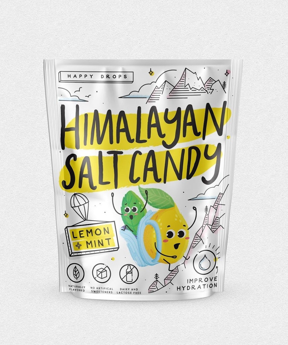
If adding illustrative graphics to your food packaging design is something you’d like to consider, think about what styles you think will communicate your message well. Perhaps you want to appeal to young audiences or the child in every adult? Bright colors and 2D line drawings work really well to exude an innocent, joyful or mischievous energy. Find designers who specialize in character illustration or doodle art to collab with and make your products shine brighter than your competitors.
4. Packaging Shapes and Forms
Whilst considering the aesthetics of color palettes and typefaces is a key element to food packaging design, the physical shapes and forms of your food packaging is extremely important to explore.
Take the humble soup, for example, the options for packaging forms are (almost) endless. You could use a plastic-lined cardboard box, a plastic pouch, a jar or the classic tin.
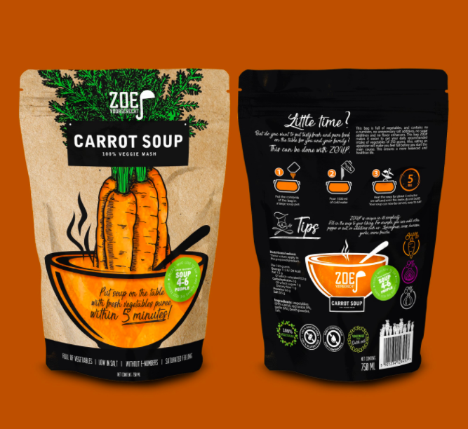
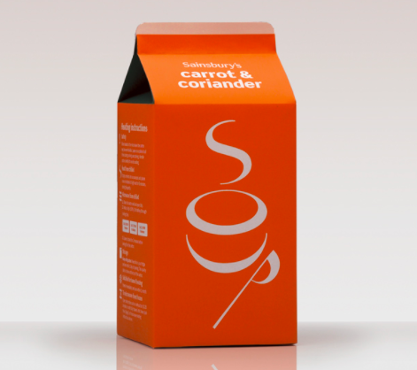
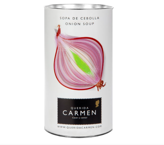
Each option offers a different message for your brand; by choosing the more luxury option you are speaking to a higher earning client and therefore can pitch the price higher. By using cheaper materials, you can offer your product to the masses.